[1] "...1"        "country"     "description" "designation" "points"
[6] "price" "province" "variety" Wine Reviews
Analyzing Trends in Taste, Price, and Quality
2024-11-29
Average price of wine by country
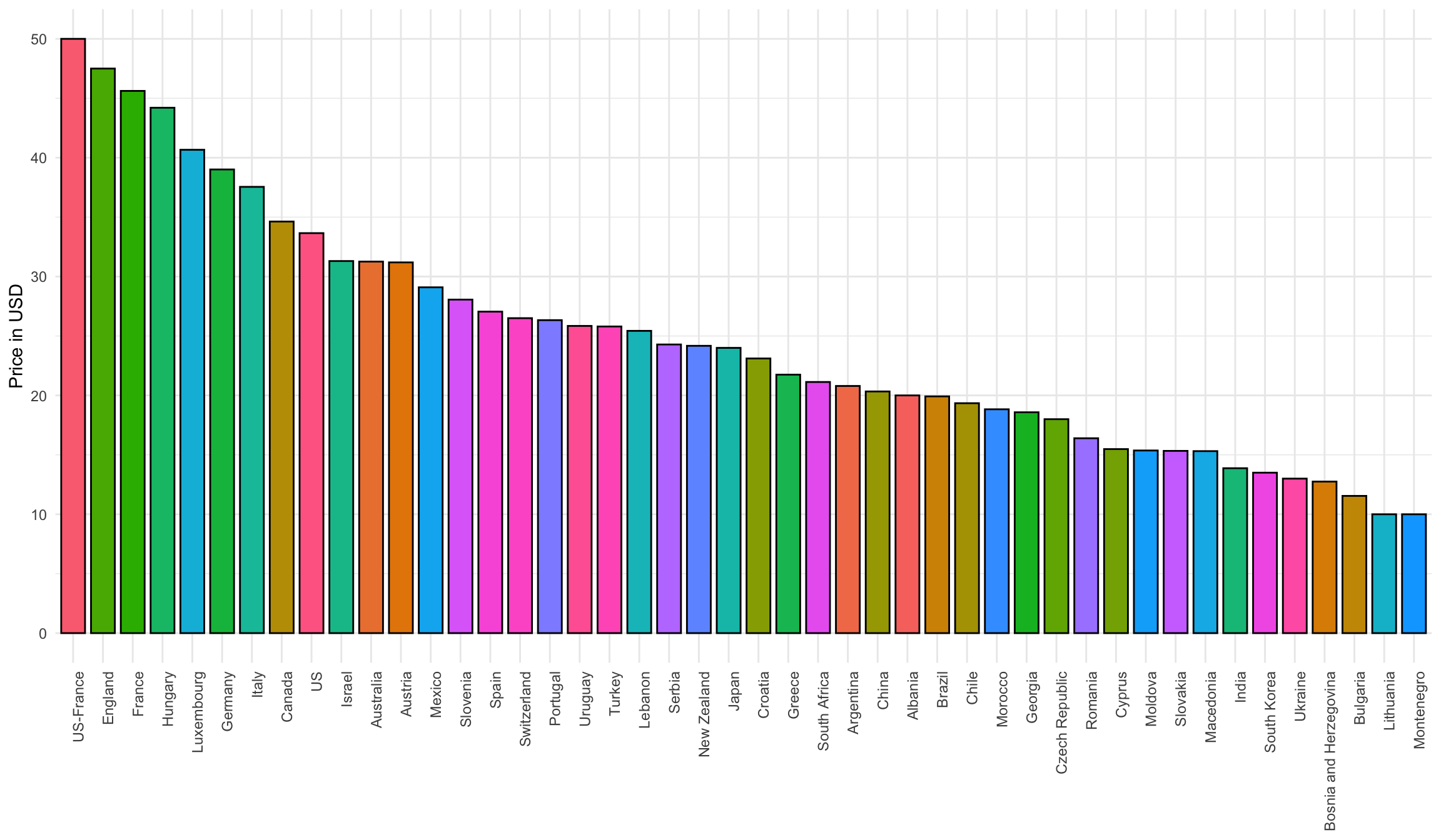
The countries that produce the most expensive wines are the US, France, England, Hungary, and Luxembourg, with average prices ranging from 40 to 50 USD. On the other hand, the cheapest wine producers are Montenegro, Lithuania, Bulgaria, Bosnia, and Ukraine, where wines typically cost between 10 and 15 USD.
Correlation between Price and Quality
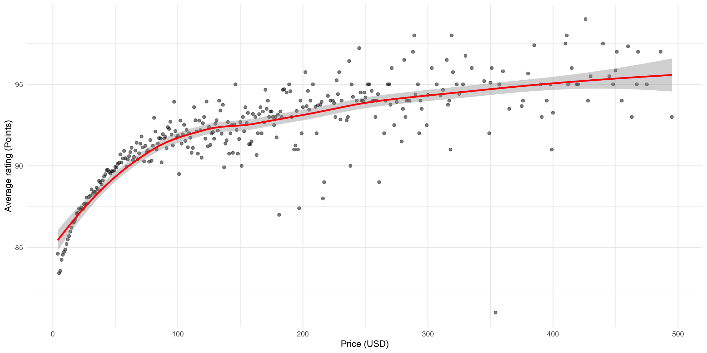
There is definitely a correlation between price and rating, with more expensive wines tending to have higher ratings. However, the relationship is stronger in the 0 to 100 USD range, where price significantly impacts quality. Beyond 100 USD, wines are fairly similar in quality, with higher prices offering only a slight improvement.
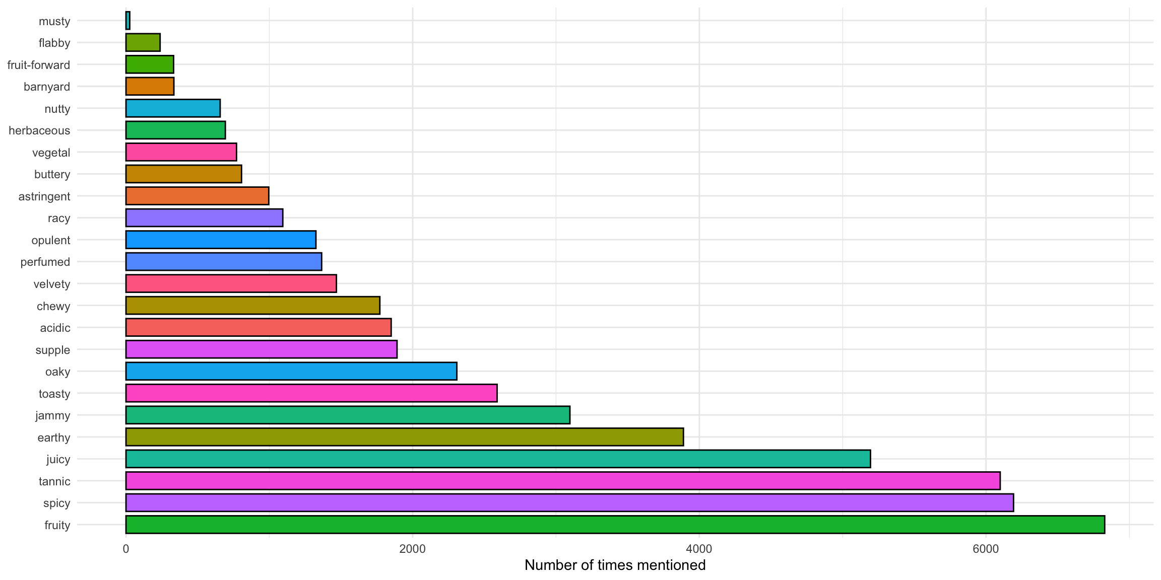
Frequency of wine adjectives
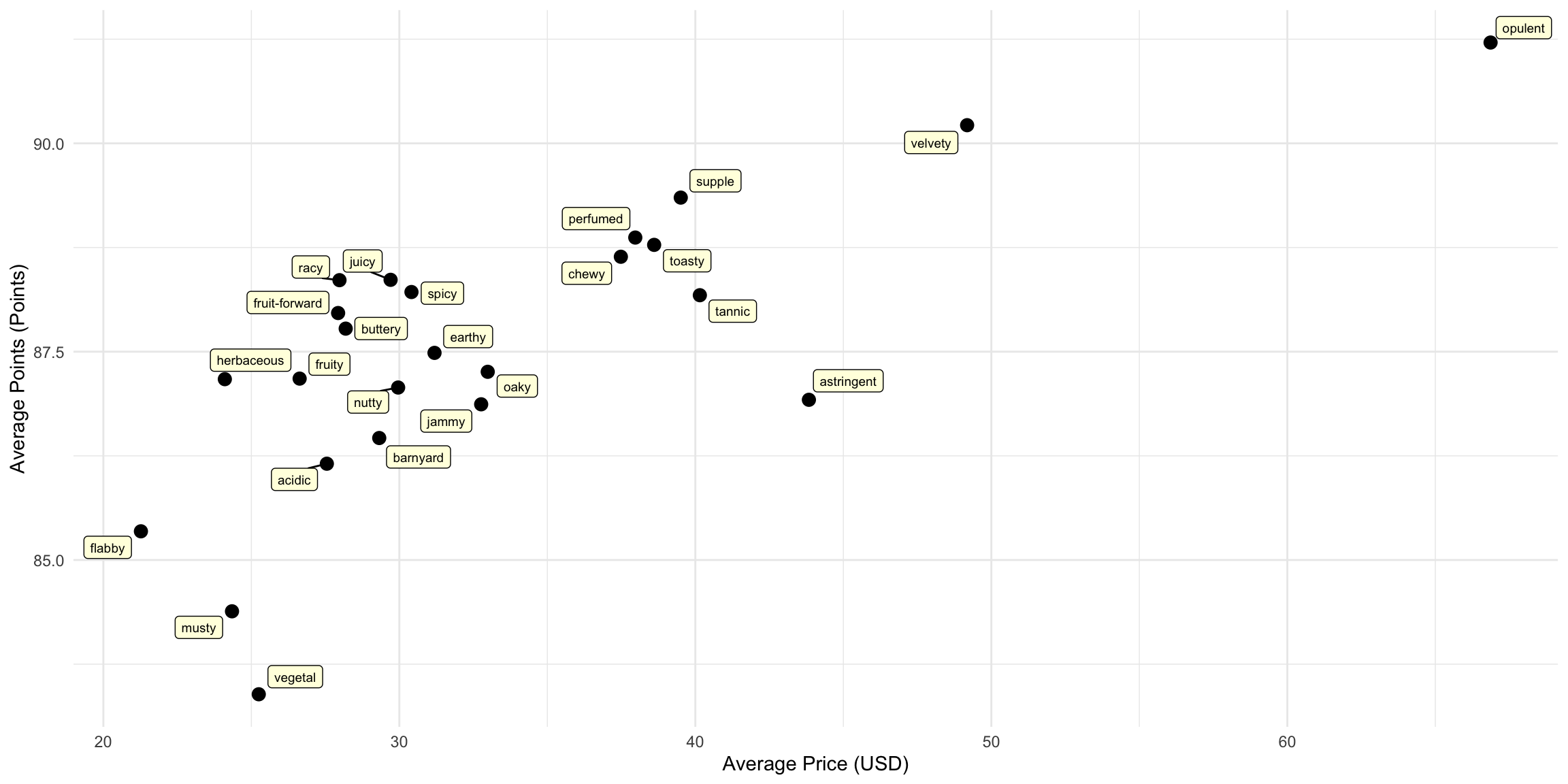
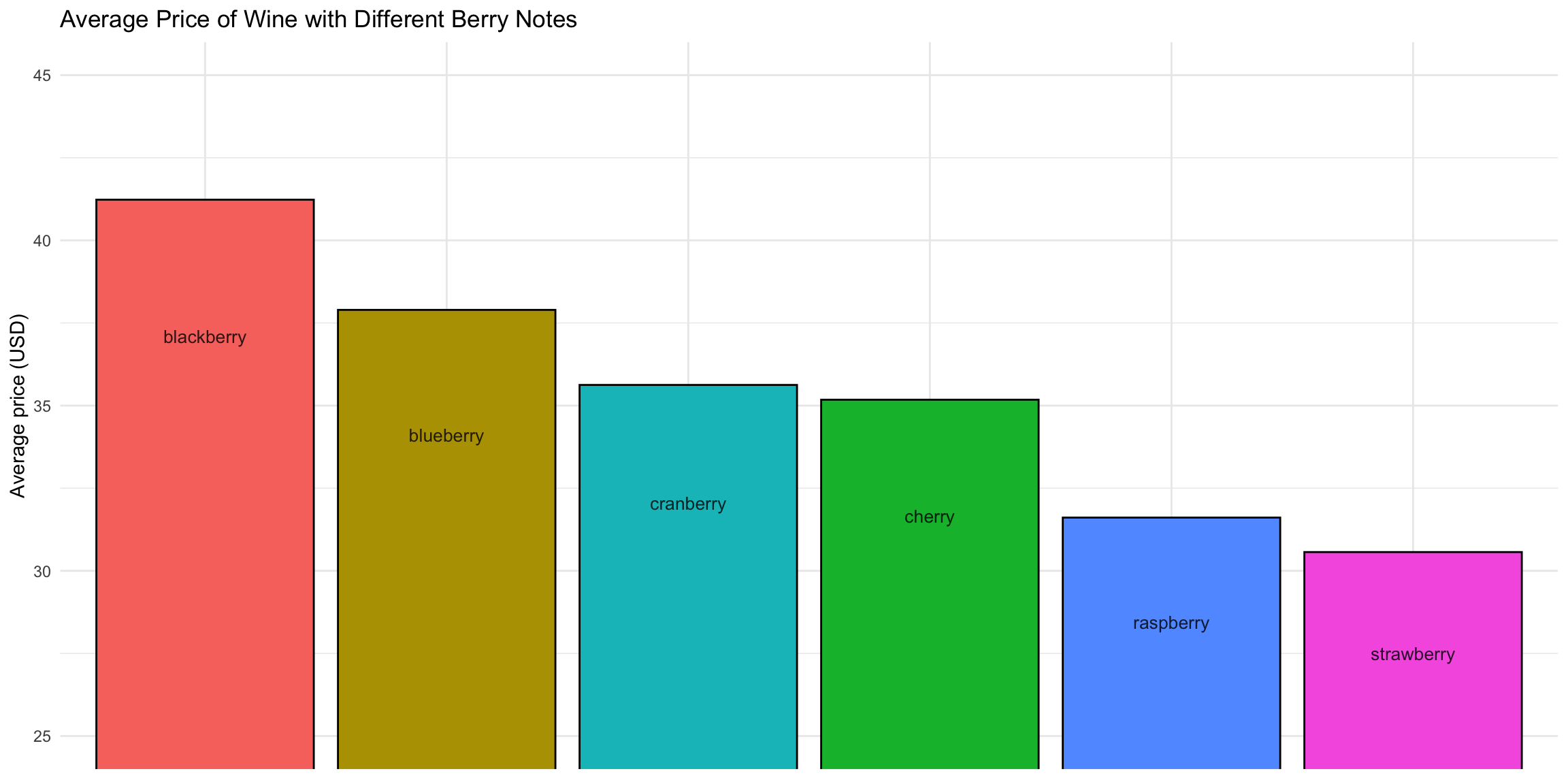
Average Price and Rating of Wine by Flavor Note
Berry Notes
Thank you for watching!
![]()